Designing and building the Hubs' demo Room
Lumin Cosmetics is a company that offers natural, ethical and cruelty-free products for skin, hair and body care. I designed a brand identity that reflects their values and vision, using a clean color palette and a modern and elegant logo. The brand identity aims to attract and engage customers who care about the environment, their health and their beauty.
Background
Mozilla Hubs was a flexible platform, enabling the creation of interactive 3D environments. It served as a collaborative tool for building virtual spaces experienced through mixed reality. Initially known for hosting virtual events in the metaverse, its applicability extended into academic settings as well.
Problem
The Hubs website lacked a clear scene that allowed visitors to understand and experience the 3D platform it offered. At that time, there wasn't a direct connection between the technical artists and the design team. The creation of this scene facilitated collaborative work between these two teams and strengthened their involvement in shaping the platform.
Process
Setting goals & Expectations
Since the time available for creating this scene was limited, we needed to establish what we wanted to communicate with it before starting. We maintained constant communication with the project manager to align on what needed to be ready by a certain deadline. Additionally, we sought feedback from other design members and technical artists before proceeding with the various versions. In total, there were three versions of the Demo Room, driven by the deadlines and the different purposes of this demo room
Ideation & exploration
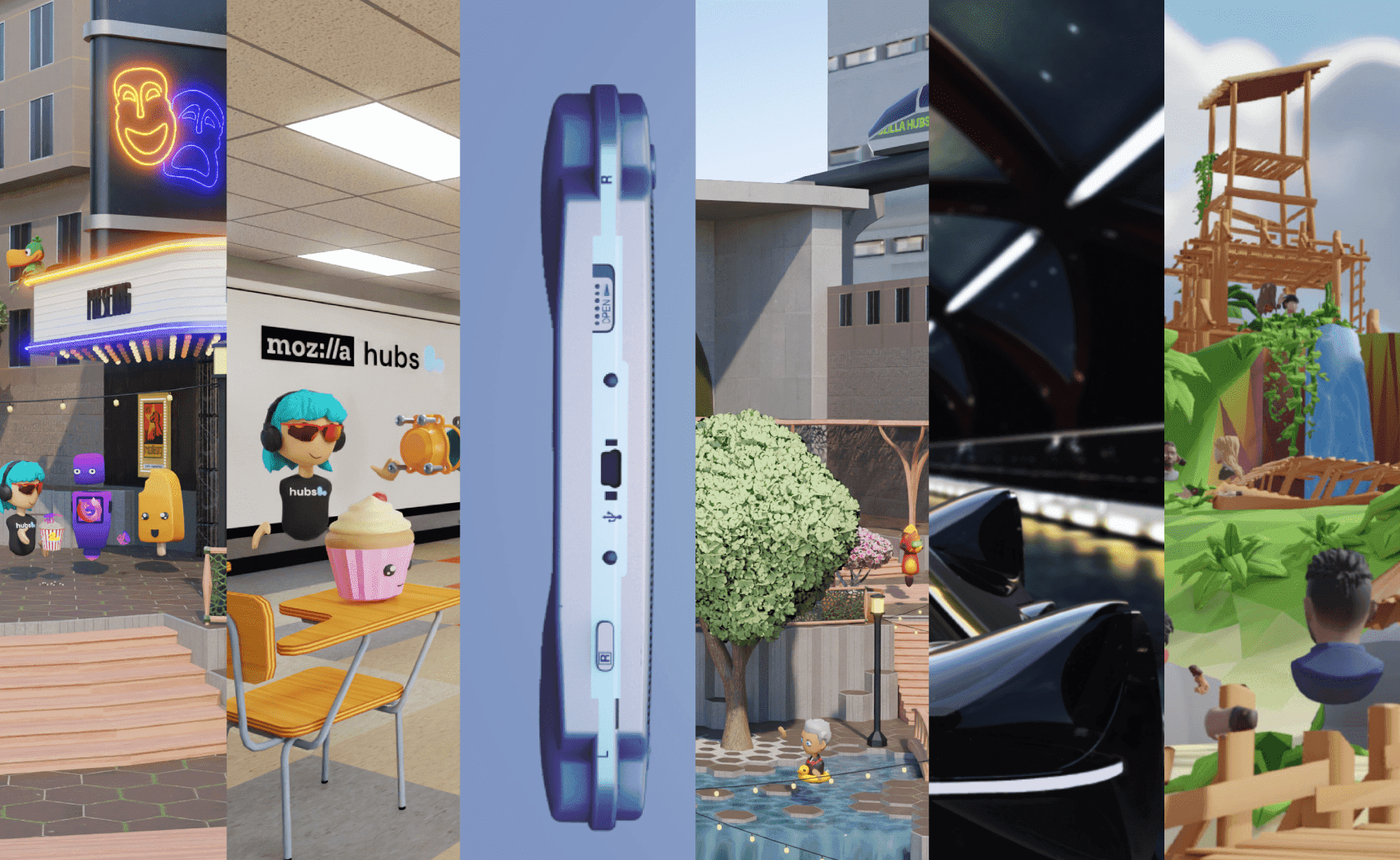
The concept was very flexible, but the idea wasn't to start everything from scratch due to the limited time given. Knowing that there were existing assets created by the technical artists and scenes already in place, the goal was not to reinvent the wheel, but to create a scene that made sense and allowed users to discover the different features of Hubs. That's why existing Hubs scenes were used, and assets/textures were modified and reused.
version #1
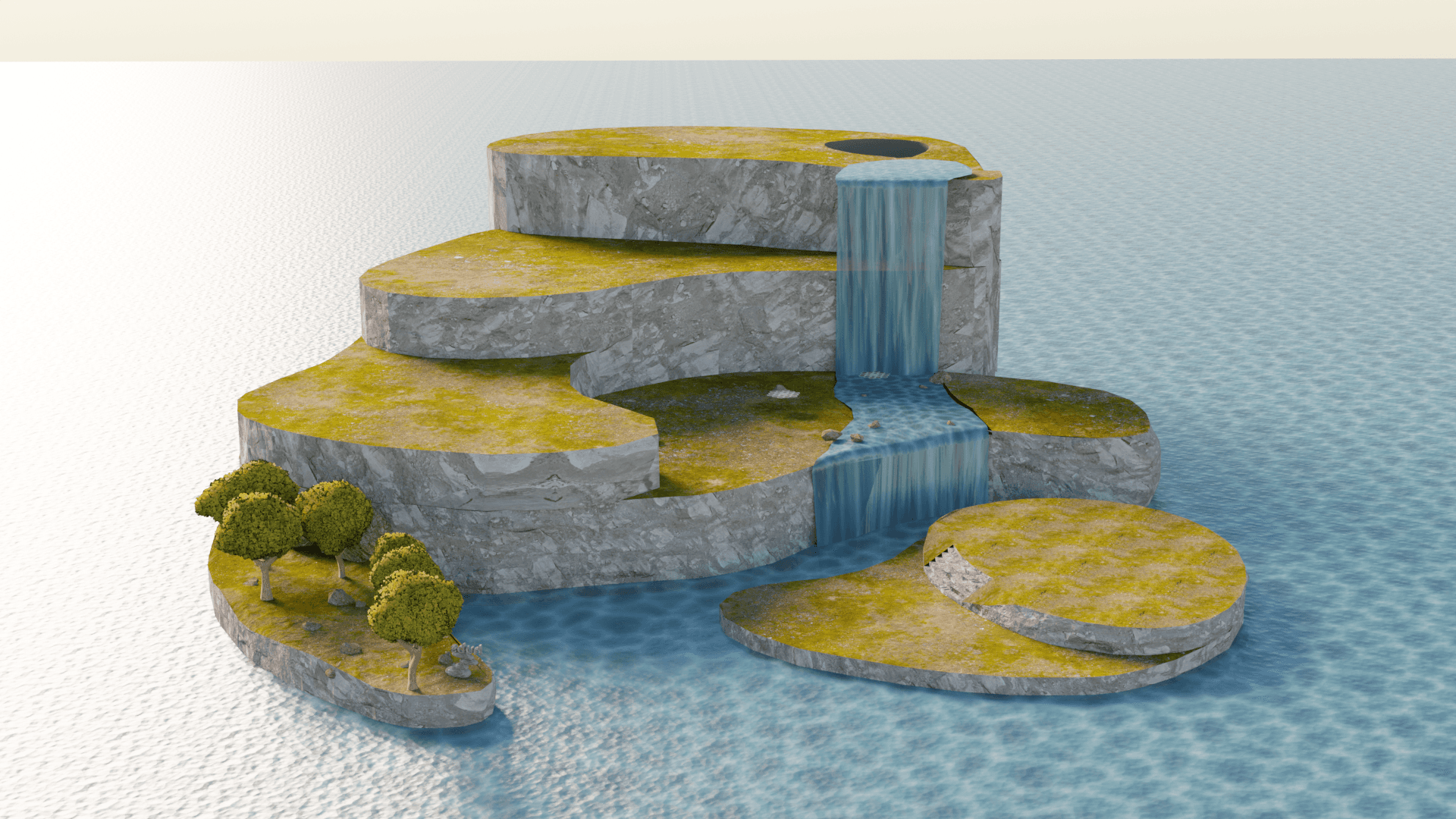
The first version of the demo room was quite basic, as I only had a week to build it. The key focus was ensuring the demo room contained the necessary information for the occasion. We utilized an existing scene, created the necessary assets, integrated effects, baked textures, and made modifications to certain textures.
version #2
For the second version of the demo room, about a month to a month and a half was allocated, which allowed for a more detailed concept and production. However, before finalizing any concept, discussions were held with the technical artists who provided valuable feedback and input in the decision-making process prior to commencement. Creating a scene of very high quality can take months of work, hence the idea was to minimize the number of textures and develop something modular that would enable flexibility in the scene's flow and reuse assets from existing scenes.
Simultaneously with the creation of this demo room, work was underway on developing the various subscriptions for Hubs. Therefore, clarity in the flow was essential to ensure that viewers could easily access and understand this information without missing it.
This demo room served as a placeholder while the technical artists could collaborate on polishing it. The goal wasn't to take on the role of a technical artist, but to foster a collaborative effort between the design team and the technical artists.
version #3
Finally, for version 3 of the demo room, we were able to collaborate more directly with the technical artists. The scenes were ones the technical artists had developed since the inception of Hubs. Together, we worked on a plan regarding the types of scenes we had and how we could adapt them to showcase what we wanted and convey the desired message. At the same time, we showcased them as use cases of how the platform could be utilized. We collaborated on the user navigation flow, panel positioning, contrasts, and the overall concept.

Since the creation flow of these scenes was extensive, the process of their development and all the features used were documented. The goal of this documentation was to identify any blockers in the user experience during the creation of these scenes and to potentially revise the flow in the future. Additionally, it aimed to communicate these blockers to developers to refine any features that could be easily improved.
The third version of the demo room was live on the Hubs website until the shutdown of Mozilla Hubs. Metrics were implemented to track how many people accessed the demo room and how many created accounts through it.
One of the most valuable skills developed was the ability to collaborate across different teams. Developing the skill to collaborate with others toward the same objective and build team relations, trust, and communication was what allowed progress to happen so rapidly. It was an amazing opportunity to collaborate with technical artists and adapt various perspectives into a common design.


